project Summary
Who is Syntellis
Syntellis provides enterprise performance management (EPM) solutions for higher education, healthcare, and financial institutions. They most known for their Axiom line of products.
My role
Senior UI Designer
My work
My work
Designing in sprints with the platform team, creating initiative to overhaul design system, internal user research, planning information hierarchy, creating Figma components, documenting best practices, testing Figma library on designers.
The project
The project
Before the start of my contract, Syntellis had recently undergone a rebranding, but the products had an inconsistent look because each vertical has a different product team. Multiple UI Designers hired at different times all worked on components and documentations for what was supposed to be their design system resulting in a mash of different design styles, practices, and component creation.
My impact
My impact
By identifying key points of friction while working as a designer on the platform team, and by interviewing the designers on each separate product team, I collaborated with the UX Design Lead to create an initiative and strategy to completely redo their design system. With the strategy in place, I was part of a team of two responsible for doing the production work of building out the Figma library and it's guidelines.
What else did I do?
Team Interviews & Research, Planning & Strategy (Collaborative with UX lead), Design System Information Hierarchy, Component Design, Web App UI Design, Testing, Copy Writing, Engineering Hand-off, Bug Testing.
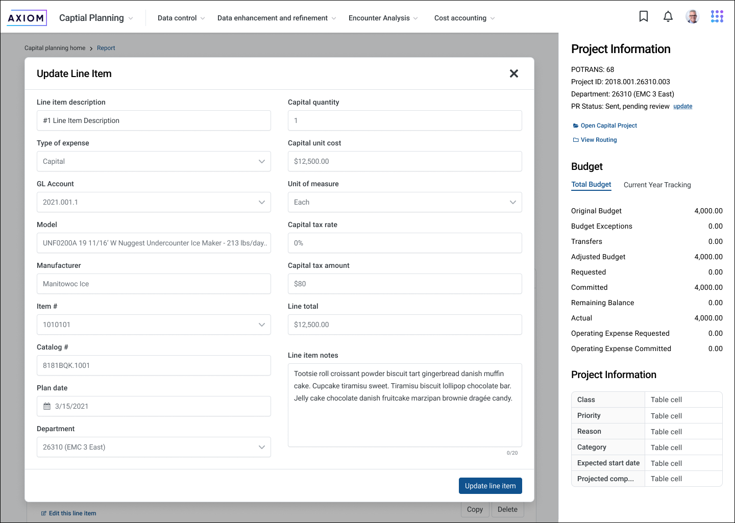
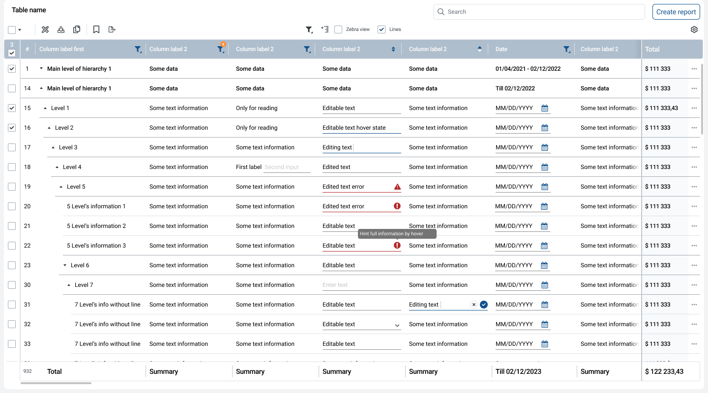
Example screen 01

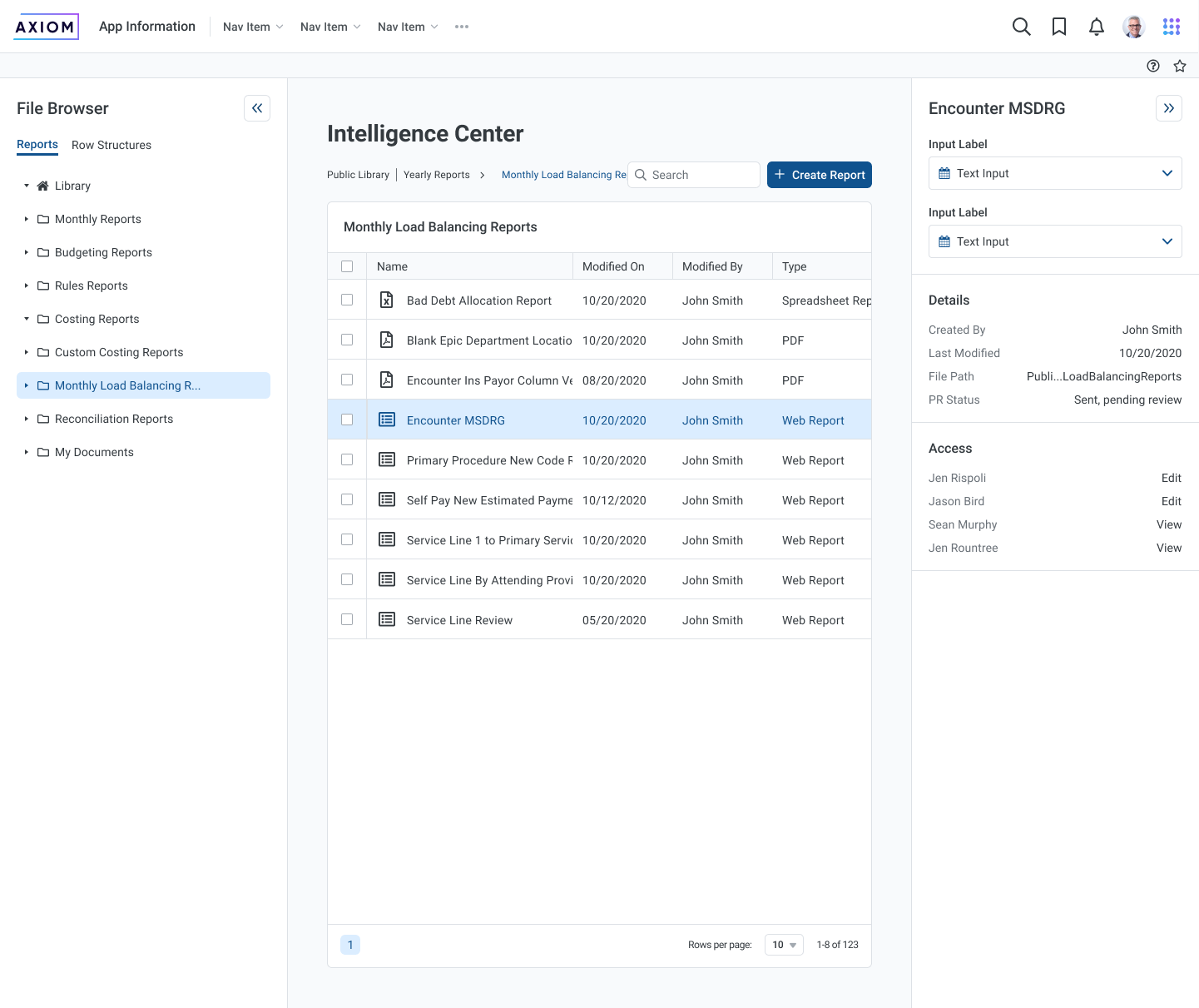
Example screen 02
These examples have had their context removed for NDA purposes
The problem
Syntellis had recently undergone a rebranding, but the products had an inconsistent look because each vertical has a different product team.
Multiple UI Designers hired at different times all worked on a design system in a silo. The end result was systems that few understood how to use or didn't work within their process. Many of these design systems were left unfinished but still trying to be used by UX designers assigned to products.
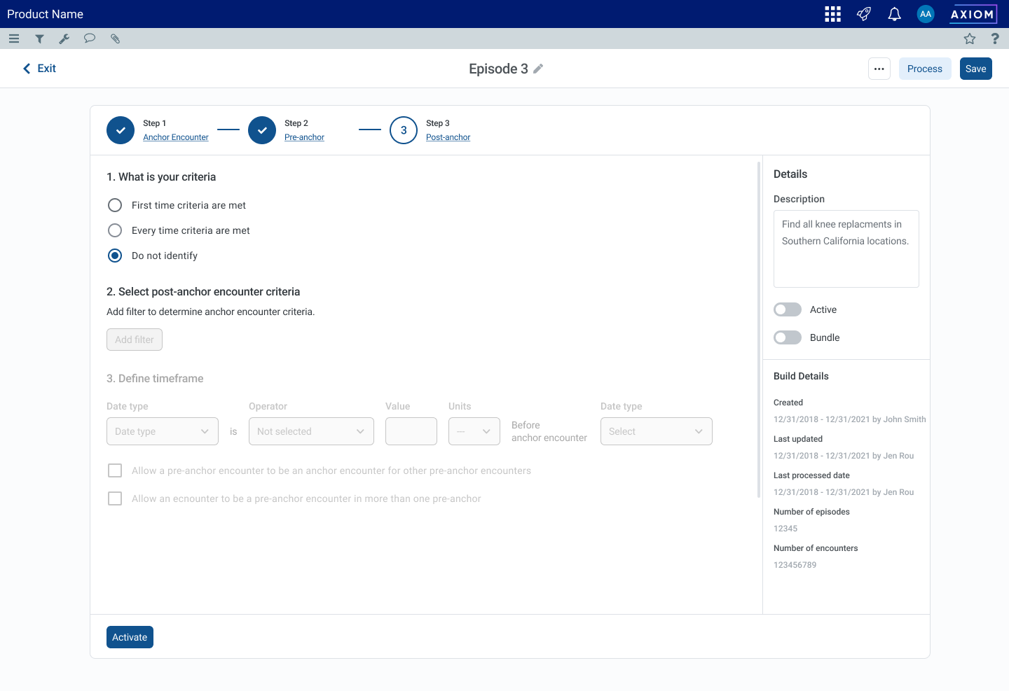
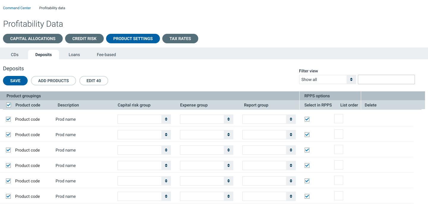
Examples of inconsistent design direction
These inconsistencies created a lot of dysfunctions between product, design, and engineering with teams often not having a clear vision. This became a major source of burn out among designers who would be hired and quit rather quickly.
The Solution
Build a new design system that serves the needs of our designers to help bridge the gap in communication to create a unified visual design across all products and verticals.
Strategy
Discovery
- Work with the platform team and form an understanding of how designs are implemented from an engineering perspective.
- Interview designers about their experiences using the current design system and find their pain points. This step would be most important as failed systems in the past did not consider the unique situations of the designers.
Research
- Research other design system to find inspiration for structure that might work well for us.
- Look into latest Figma features and trends to better understand how we can best use our tools.
Build
- Redesign all of the UI components to meet our new standards.
- Document best practices on how to use each component.
Test
- Test new UI components with our designers
- Get developer buy in on design decisions and technical rules.
- Iterate on our findings to improve the design system.
Design System Features
Documentation in one place
We wanted to sure UX Designers never needed to leave Figma to utilize the design system, so we put all documentation and components in Figma.
Component cards
Like a cheat-sheet, components had cards that had their states and variants laid out with their usage explained in each.
All-in-one components
The new Syntellis Design System heavily utilized variants to keep the Figma component library compact and easy to scroll through at a glance.
Responsive components
Components were carefully crafted to resize properly. We wanted to make sure questions like "What happens if the text is longer?" and "What happens if container resizes?" to be self-evident by simply using the component.
Atomized modular components
Most complex components could be built up by other components. While we didn't strictly follow an Atomized Design philosophy, we incorporated the concept of atomized components into the design system.
Spacing breakdowns
Our overseas developers struggled with delivering on pixel perfect spacing when building components. It was a requested feature to have box models broken down for them visually.
Templates
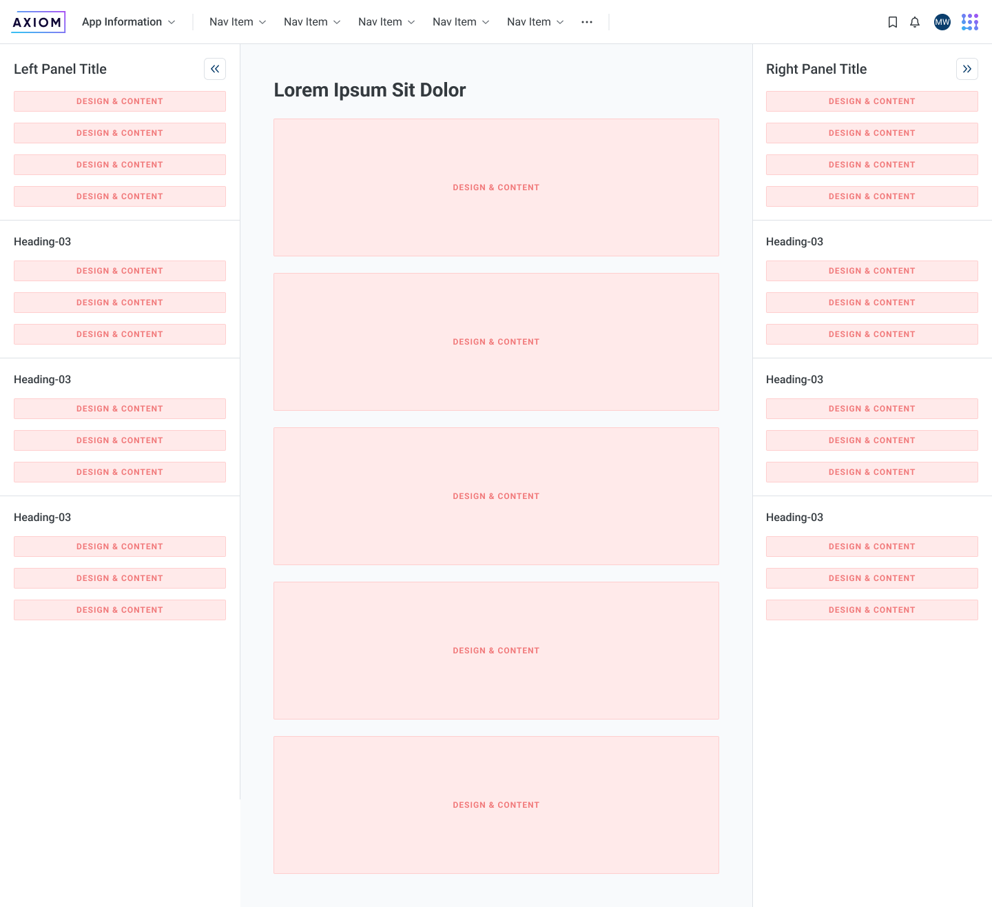
Designers could use templates that were made up of our built components to start their design process.
