Who is Realogy?
Anywhere Real Estate Inc, formerly known as Realogy during the time of my employment, is an American publicly owned real estate services company. Its most prominent brand is Coldwell Banker. For the sake of this case study, I will be referring to them as "Realogy."
What is Exclusive Look?
Exclusive Look was a property listing platform for Coldwell Banker Agents and their clients. Exclusive Look offers three key tools that give agents, home buyers and sellers several advantages in their real estate transactions: exclusive property listings available nowhere else, sneak peeks of listings before they hit MLS, and wanted ads for agents with clients that have specific housing needs.
Exclusive Look Search Page (Designed by me)
Project Summary
Overview
Coldwell Banker Agents were using Exclusive Look to get a leg up on the competition. Exclusive Look allows agents to see 'Sneak Peeks' of properties one business day before they go on MLS. While the rest of the web app functions as a listing service, this one feature is what agents were most interested in.
I was brought on the team to redesign the listing experience and update all UI components to be in line with the new visual direction the company was taking.
My Role
UX Architect - All research and interactions for the redesign.
Product Designer - All wireframes, UI design, and development hand off of redesign.
Tools
Figma for UI & Prototyping
Dovetail for Research Documentation
Maze for Prototype Testing
Problem
Many agents complained of a difficult user experience listing properties on Exclusive Look. They were using other listing services like Zillow, which gave them a baseline of what they were expecting that Exclusive Look did not meet. This resulted in a less than desired number of agents adopting Exclusive Look in their list of tools they use.
My Approach
1. Discover what aspects of the listing experience cause them pain points and present my findings to leadership and the team.
2. Redesign the experience based on the findings.
3. Test the new listing experience with agents.
4. Delivery development ready UI.
REsearch
I was assigned to this product after it had already launched. I inherited a lot of unfinished designs and half-written documentation. With very little time to produce results, instead of trying to make sense of the noise, I figured it would be far easier and valuable to simply watch agents use Exclusive Look in a usability test and to interview them.
Usability Testing & User Interviews
I observed agents putting up several listings and noted their pain points and feedback via Zoom calls.
Observations
Agents struggled to fill out the forms and often made preventable errors.
The column layout caused confusion, and agents would fill info left to right across columns instead of staying in one column.
Agents were skipping over required fields.
Agents started to get frustrated at how overwhelming the experience felt.
Old Design
Observations
The Redesign
I had several hypotheses to solve these pain points.
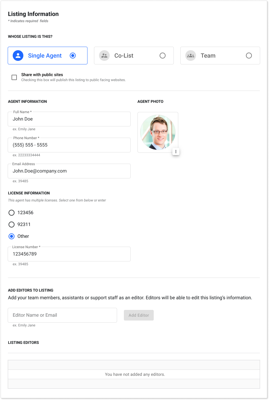
Hypothesis 1: Reorganizing the information hierarchy of the input fields and grouping them together will relieve some of the mental load.
Hypothesis 2: Breaking up the input fields visually into cards and grouping them by categories will help prevent an agent from feeling overwhelmed trying to figure out what to enter in first.
Hypothesis 3: Preventing agents from proceeding and before going over required agreements will stop them from skipping the step.
Other design considerations
1. Reduce custom components from previous designer work and use material UI for consistency.
2. Collaborate with other product teams to see how they’re products look and feel to create a consistent look and feel.
3. Developers had expressed their misgivings for how they were getting deliverables handed to them in the past. Figma doc should be organized with pages, frames, and layers, and components labeled.
NEW DESIGN
Validation Method
I tried several different iterations of the form using Maze.io to test interactive Figma prototypes of each design. The new design here had the most success defined by the most completion rate, least number of misclicks & errors, and fastest completion time.
Result
Agents were overwhelmingly pleased with the new design and experience. They particularly liked how organized it was from before. They also enjoyed that it functioned like other Realogy products they were already familiar with. (Although functionality didn't really change, but the component design did)
What was a 5 to 10 minute task previously now took agents an average of less than 5 minutes to put up a listing.
Other UI Related to Exclusive Look
While the form redesign was the largest impact I made, I also did quite a lot of design work on the entire product. Here are some more examples of my work:
Mobile Views
Mobile Scroll Behavior for Devs
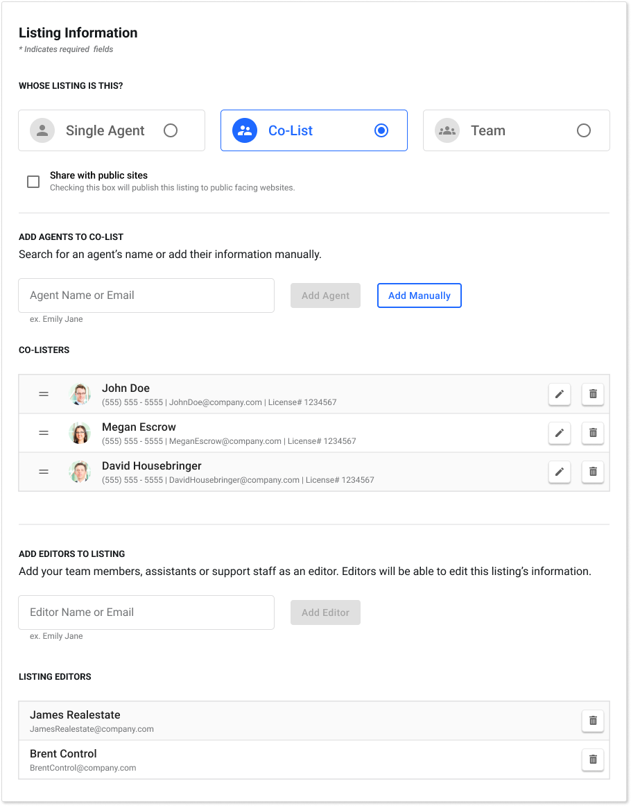
Listing Variations: Agent / Co-List / Team


Listing View
Search Functionality
Component Breakdown for Devs
