Project Summary
My role
Design Lead
My work
UX Research, Competitive Research, Strategy, Presentation / Public Speaking, Wireframes, Prototyping, Testing, Copy Writing, Art Direction, Team Management & Coaching, Vector Illustration, IOS UI Design, Android UI Design (Partial), Web Design
The project
Lucky Day noticed their advertisers were primarily micro-lending apps. Lucky Day saw this as an opportunity to tap into their own user base with a microlending app of their own called Lucky Day Finance. I was hired to create a foundation of research and to formulate a user-centered strategy to build this app from. 
My impact 
Through UX research, I would learn why people fall into a cycle of poverty and how micro-lending apps could assist in emergency situations. With this new understanding of the problem and how we could help with micro-lending, I pitched a new strategy to Lucky Day. Lucky Day Finance would be redesigned and rebranded into COVR with a fun and playful visual identity. My strategy and personal execution of designs became the heart and soul of this project and sister company, turning what was originally a copy-cat product into a project with a heart and soul that wished to help those in need. 
My Creative Team
Design Lead
Weston Durant
UI Design
Weston Durant
Chris Feratu
Product Manager
Chris Hayden


Animation
Jose Tores
Concept Art
Andrea Rodriguez
Vector Illustration
Weston Durant

------------------------------------------------------------------------------------------------------------

What is Covr?
78% of Americans are living pay check to paycheck
This means a majority of an American’s paycheck goes towards cost of living. Because very little goes into savings, they have limited options for smoothing over unforeseen expenses. 
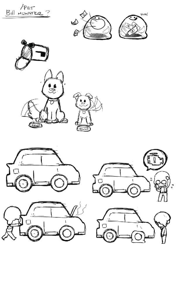
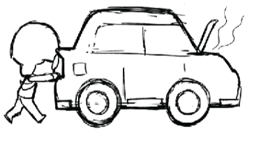
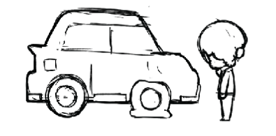
In the case of minor emergency such as a flat tire, many must wait until their next paycheck. Because they also lack access to credit. This puts many at risk of an overdraft.


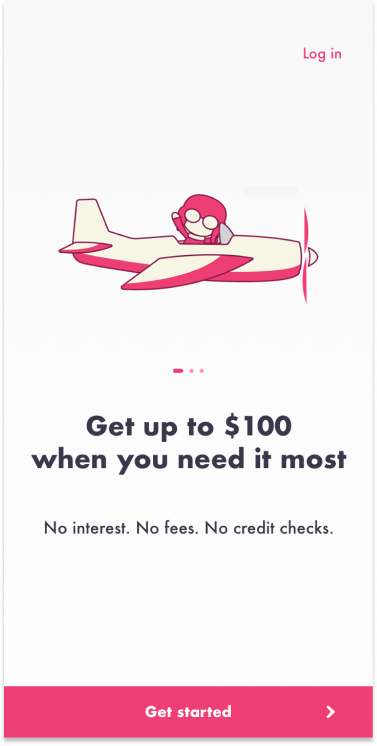
Up to 100 dollars deposited into their checking account
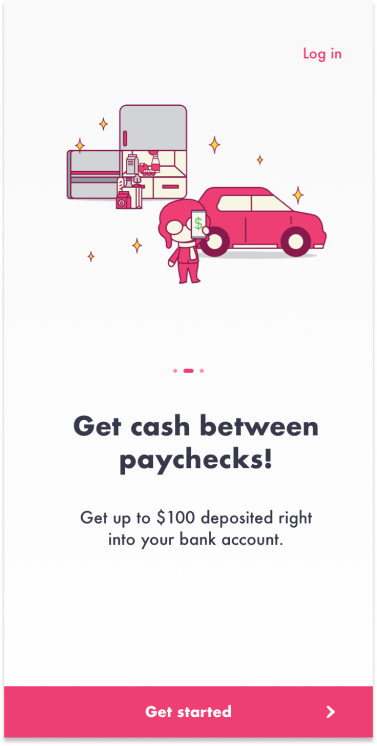
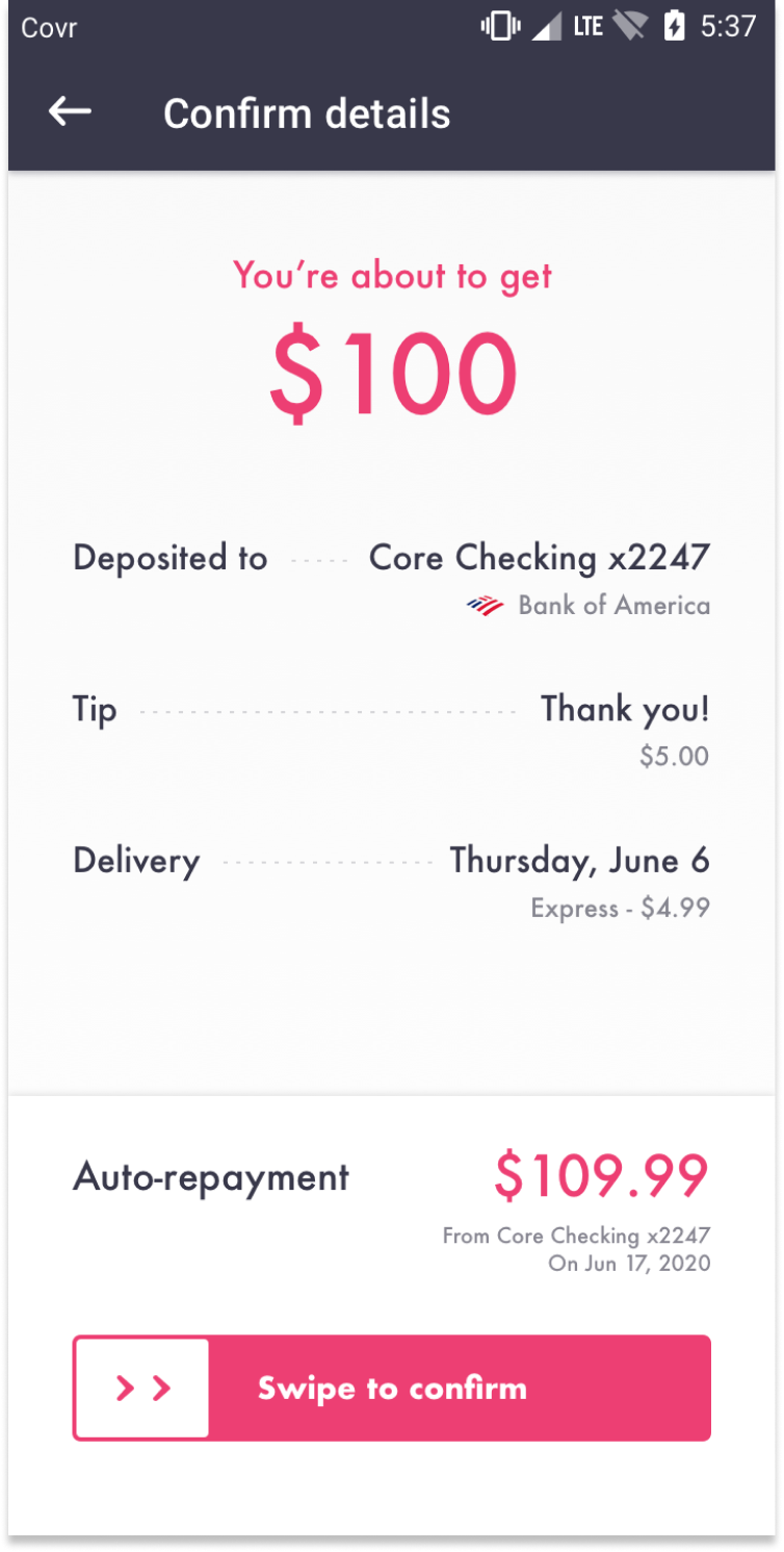
COVR looks to help people dodge overdraft fees by depositing up to 100 dollars into their account. A convenient and immediate alternative to cash advances with outrageous interest rates. Users pay COVR back once their next paycheck hits their back account and the money is given without any interest rates.
Our goal was to penetrate the microlending market and eventually scale into offering banking services such as checking accounts, savings accounts, and debit cards long term.


------------------------------------------------------------------------------------------------------------

User Interviews
Before creating product requirements, wireframes, or designs, it was important that I interview the type of people who go paycheck to paycheck to understand the problem this product was attempting to solve as Lucky Day started this project solely on it's business opportunity. This ultimately helped us develop our product requirements. 
Finding Interviewees
I was able to find a lot of willing participants for interviews and even future prototype testing. Not only did most people in the office know someone who was living paycheck to paycheck, the parent company Lucky’s Customer Service Team had many participants from the Lucky Day App willing to talk as well.
16 participants were selected for 30 minute phone interviews about the type of struggles they experience living paycheck to paycheck and their perceptions of loans and banks.
Key Insights
What causes someone to perpetually go paycheck to paycheck?
From my interviews there are many contributing factors to this:
-  No one taught them best financial practices. (Lack of education)
-  No access to credit to smooth over unexpected expenses causes more hardship from overdraft fees.
-   Living in area with high cost of living.
-  Simply doesn’t make enough money.


KEY TAKEAWAY
People end up going paycheck to paycheck usually out of situational factors that are beyond their control.

By acknowledging this fact in our messaging, we may be able to make them feel as if we do understand their problems.
What strategies do people currently use to avoid overdraft fees?
- Most interviewees were actually very budget conscious. They have to be. A poor assumption was that these users were simply irresponsible with their money. This was not always the case. Many were very strategic but did not know what options they had.
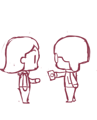
- To avoid overdraft fees, someone would use a friend and trade money on PayPal using a cash advance feature that had a large fee.
- Creatives would sell their art or craft to try and make up the money.
- There are several key bills that can be deferred without too much effort, for example, car bills.
- Few ever actually asked relatives for money unless they were extremely desperate as these users carry a lot of shame with them.

KEY TAKEAWAY
These people are actually very strategic when it comes to avoiding overdraft fees. But the methods they use comes at the a generally great expense to themselves. None of the people interviewed knew of payday loan apps, so we can expect the user to give us a lot of scrutiny. Transparency will be key in gaining our users trust.


How do they feel about financial institutions and loans?
1. Most interviewees had previous poor experiences with banks and loans.
2. Many have had banks or the government fail them in some way, so they don’t trust others with their money in general.
3. Many were skeptical of banks, cash advances, or anyone else handling their money but them. They feel that they might scammed into something, or sign something that will make them lose more money especially when it comes to cash advances.
4. Those who have used cash advances see it as a desperate last resort that only postpones their problems.
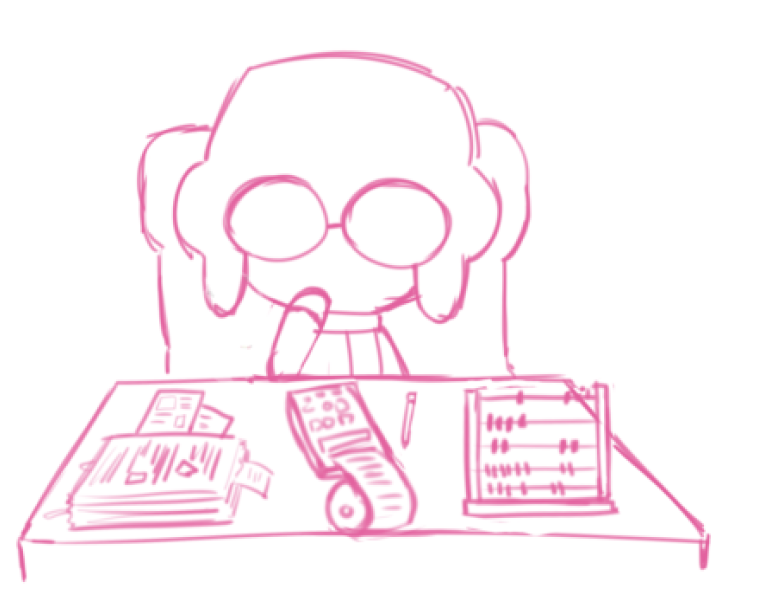
5. They find it difficult to navigate the financial jargon and reading through all the fine print with loans, and worry that if that they might be getting taken advantage of.

KEY TAKEAWAY
The biggest thing we could offer this type of user is transparency in a straight forward and simple way to explain. No beating around the bush or hiding info.

------------------------------------------------------------------------------------------------------------

Competitive Analysis
After learning more about the kind of challenges our targeted users face and their perceptions about loans and banks, I took a look at our competitors to see how we could penetrate the microlending market. 

Notable Competitors
Dave, Earnin, and Brigit were the three main competitors we focused on. 

The analysis focused on the following:

1. Amount of money offered.
2. Cost of using the service.
3. Sensitive info asked for.
4. How difficult to get first cash advance.
5. Visual identity, brand narrative.
Break Down**
** The details of these services have changed considerably since 2019
Takeaway
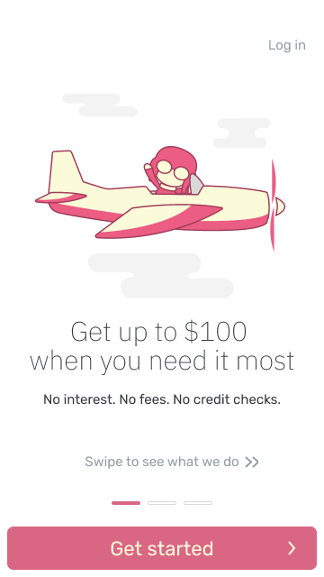
Brigit by far had the best and most simplest experience. Earnin offered the most cash but was incredibly intrusive, needing some user to transmit location data all day to show proof of them going to work. Dave felt the friendliest and was pleasant with its illustrations, but its onboarding had so many unrelated features push onto the user and had a very strange screen that required the user to write a sentence word-for-word about paying back Dave on time. And yet, Dave was the most successful of the apps. We attributed this to their charming visual identity and their narrative of "your friend Dave spotting you money." It's cute, but they disassociate themselves from financial institutions. From our user interviews we know our users dislike financial institutions. 
We decided our approach would be the following:

"Be as simple as Brigit with the charisma of Dave." 

Simple onboarding and a charming illustrative brand would separate us from our competitors.  We would take the strengths of our competitors and combine them into one product. 

------------------------------------------------------------------------------------------------------------

UX to UI
Knowing that a simple and frictionless onboarding was key to set ourselves apart from our competitors, we went through many iterations of the MVP and tests to get it rid.  
Evolution of Screens
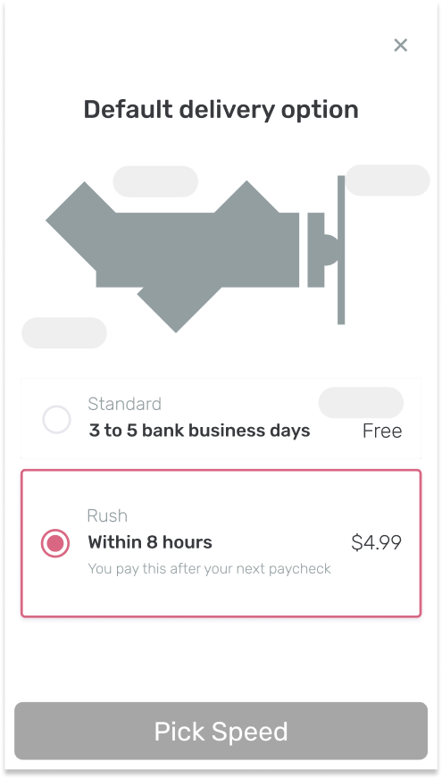
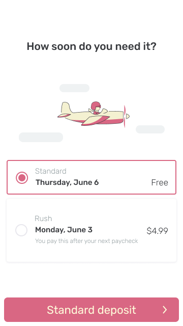
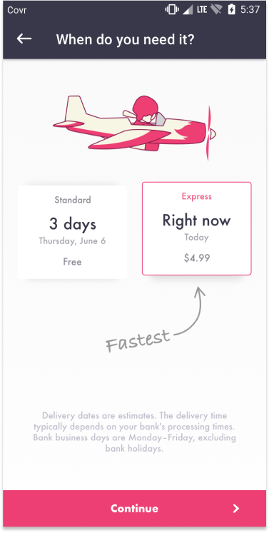
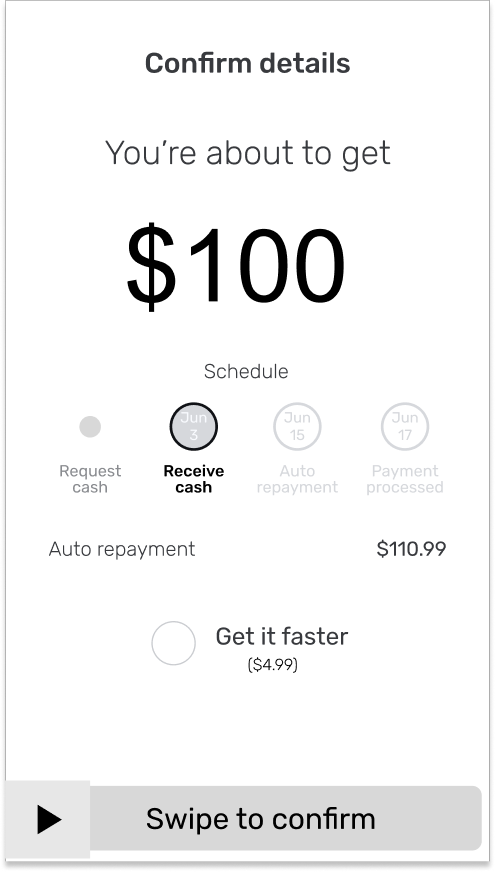
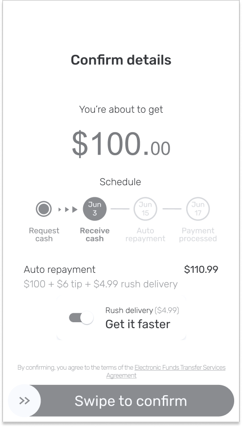
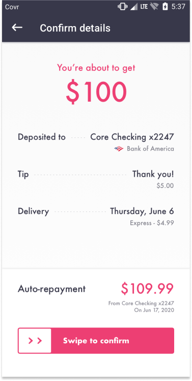
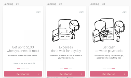
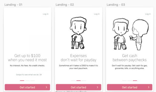
Here are some examples of screens from wireframe to final version. Testing was essential to improving between each iteration. 
Some key improvements you can see in the above examples were: 
1. The changing of brand colors to have more contrast. 
2. The changing of our font from Rubik to Futura to maintain our cartoonish feel but also increasing readability
3. Less emphasis on our mascot and animations and more focus on vital information.  While we were excited about our illustrations and animations, at times they could distract from the process. 

Challenging Regulations
Keeping to our ideal of a simple onboarding was difficult. The largest challenge we had was compliance with finance laws revolving around loans. There were many edge cases and different levels of qualification that we had to consider and some of them really makes onboarding a long process as the higher risk a user was of defaulting, the more sensitive information we had to ask of the user.

Early example of escalating security questions. We later needed to add more steps for compliance reasons. 
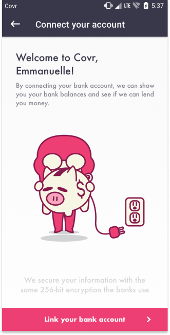
Link bank process, showing potential need for additional steps at times. 
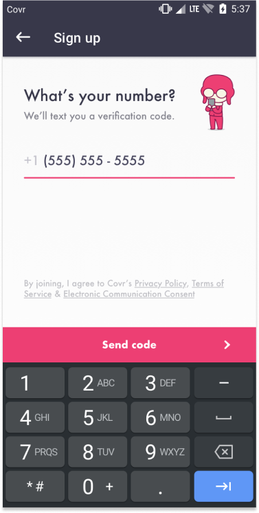
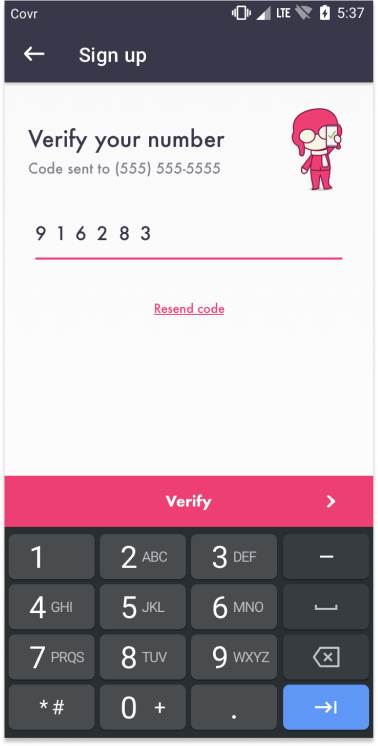
Phone number verification flow showing different edge cases and error states.

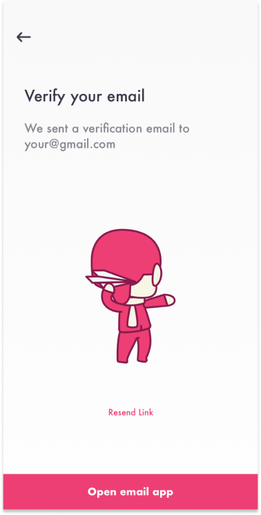
I mapped out the different scenarios a user could go through while qualifying for money. Working closely with our engineering team, we were able to create progressive qualification. An onboarding that only asks what it needs. For some users, we only needed phone number, and a confirmed email. For many we needed the last 4 of SSN. 
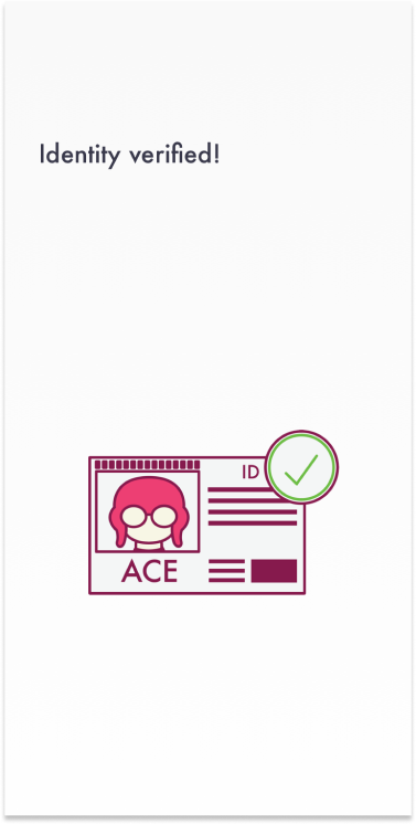
In some cases, we needed a photo of their ID or the manual approval from our ACH provider's qualification team. But we cut this functionality in the MVP. 

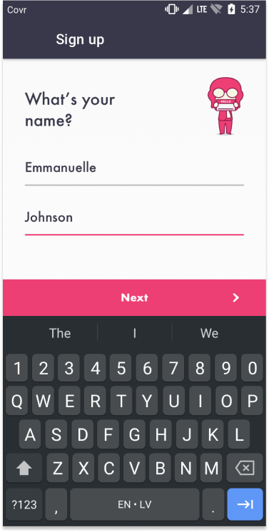
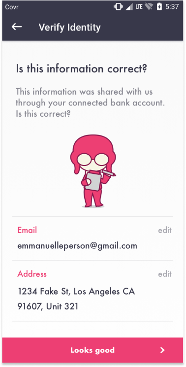
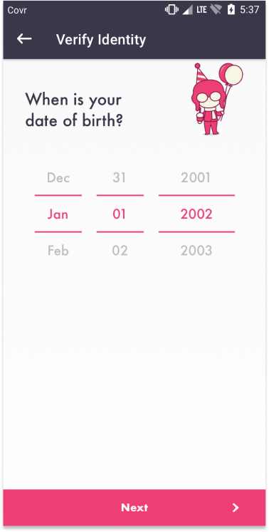
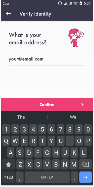
Onboarding Screens

------------------------------------------------------------------------------------------------------------

Illustrative Brand
As the UI was approaching its final iterations, I was made Lead Designer for COVR and tasked with creating a charismatic and wholesome brand that could rival Dave's. I built a team consisting of a UI designer to continue efforts on the app and implement our new brand, a concept artist to iterate and develop our mascot and help me pitch ideas for approval, and an animator to bring our app to life with JSON Lottie animation.

Introducing Ace!
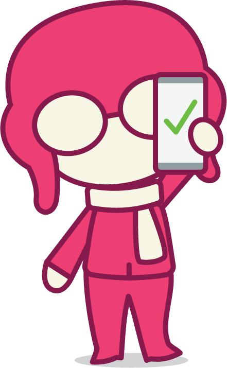
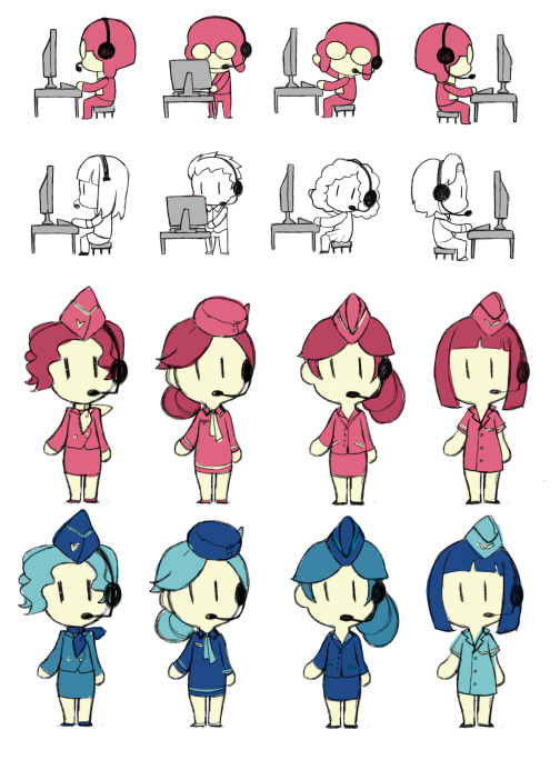
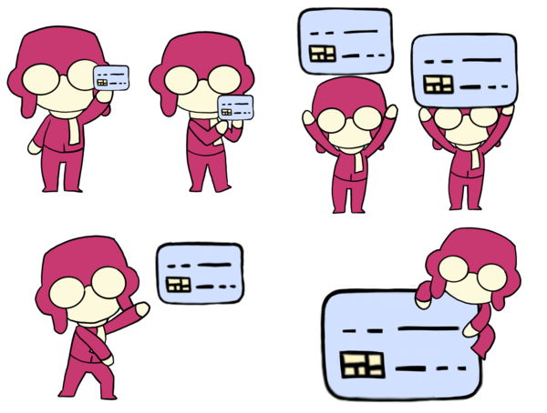
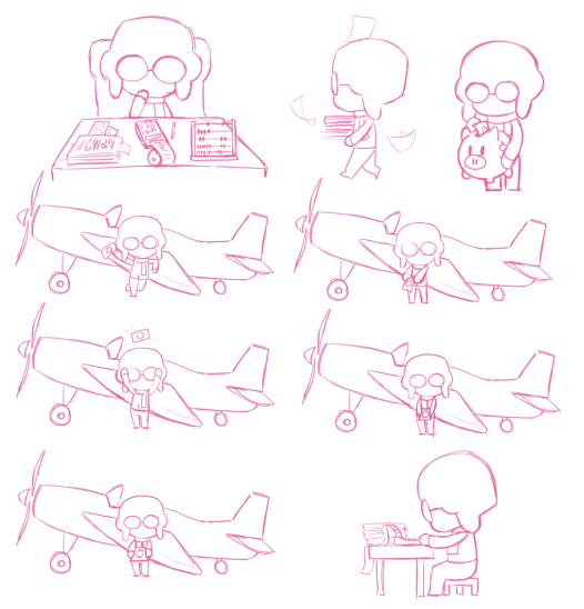
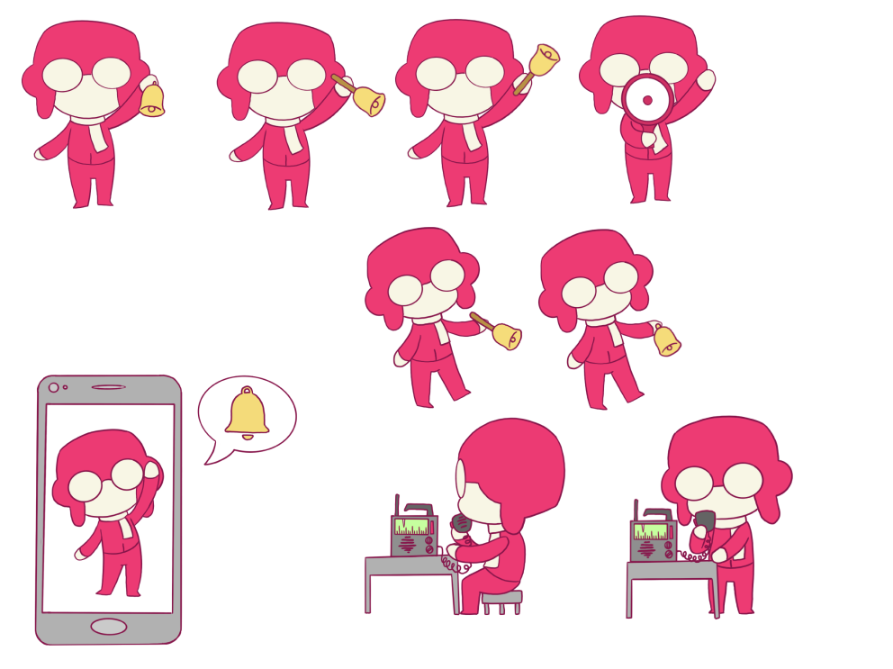
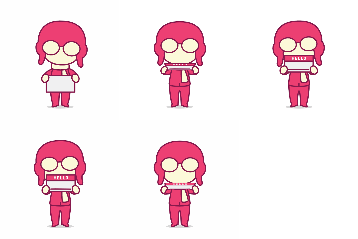
Ace is COVR's hard working mascot. He can be seen doing all the operations of our app from taking down your information, connecting your bank account, being your customer support agent, and other company functions. But his main gig is that he pilots his plane to hand you money as fast as possible to get you out of a bind! 

Mascot Development
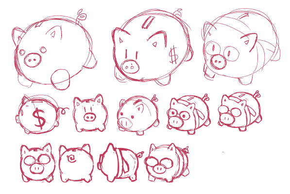
I contracted Andrea Rodriguez to be our concept artist. During the inception of Ace, we would meet in person for design studio sessions and flesh out ideas rapid fire. I would direct her and she would pump out concepts rapidly. I would then take the ones that stood out and turn them into vector art using Adobe Illustrator. 

I wanted Ace's design to be well documented so that his proportions and details could be replicated by future artists and designers to keep the brand consistent. 

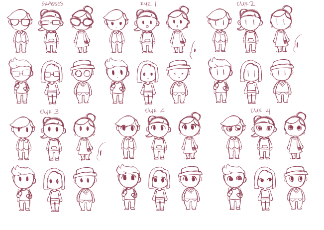
Helmet & goggle iterations


Movement & expression exploration

Vectorized forward-facing Ace


Line-weight exploration

Rapid Concepting

Concepts for onboarding illustrations

Concepts for different level of error states. "Warning" "Recoverable Error" "Hard Stop"

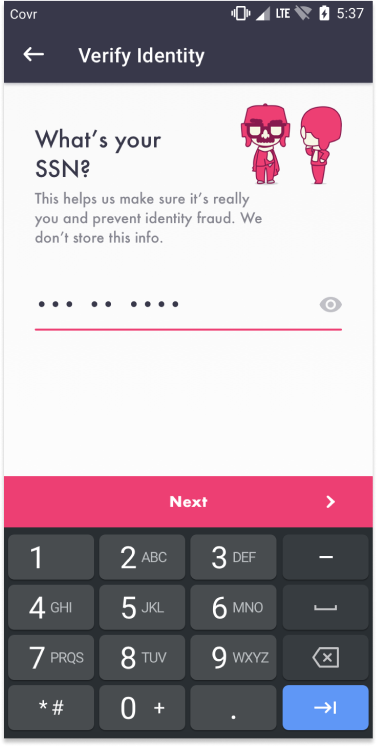
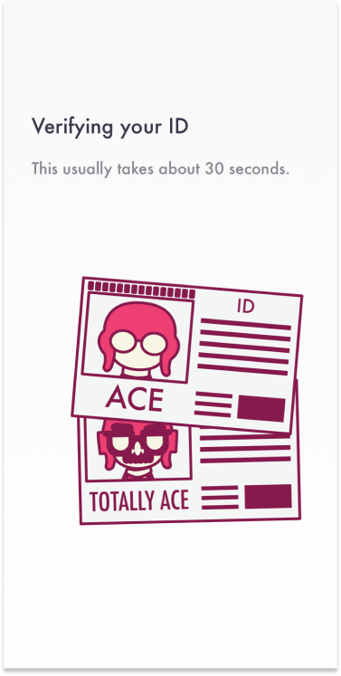
Concepts for "Totally-Ace" to represent topics involving identity verification. The idea was to present asking for sensitive information like SSN in a light-hearted manner to show we are trying to prevent fraud.

Concepts for COVR website company culture illustrations. Vacation, benefits, free-lunches, team-outings, etc. 

Miscellaneous Concepts
Ace within the team
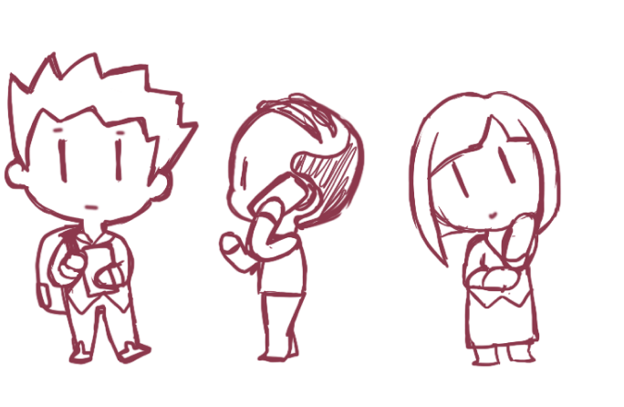
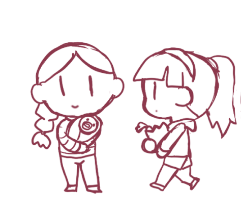
Ace became the face of COVR. His addition to the app had an effect on the team that I did not expect. He became a fun piece of our team and that really brightened our spirits. He breathed some life into our work and everyone wanted to be part of the brand process! 
I had Andrea make art of Lucky Day's mascot and COVR's mascot building a snowman and gave everyone in both companies little gifts for the Holidays. 

------------------------------------------------------------------------------------------------------------

 Implementation
We had to move fast. I promised that adding a large amount of illustrations and animations to the app would not slow down our timeline nor interfere with my normal Product Design duties. In order to make due on that promise, I used the following process to pump out dozens of illustrations and Lottie Animations while maintaining velocity on UX & UI.

Product Manager Chris H and I continued designing the app end to end with all edge cases. Chris F and I divided and conquered on UI to complete the product. Andrea and I would create illustrations together and develop the brand. I would puppeteer our illustrations and hand them off to Jose to animate into Lottie animations. Finally with everything completed, Chris H and I would deliver the final designs and animations to our engineers.
Vector Illustration
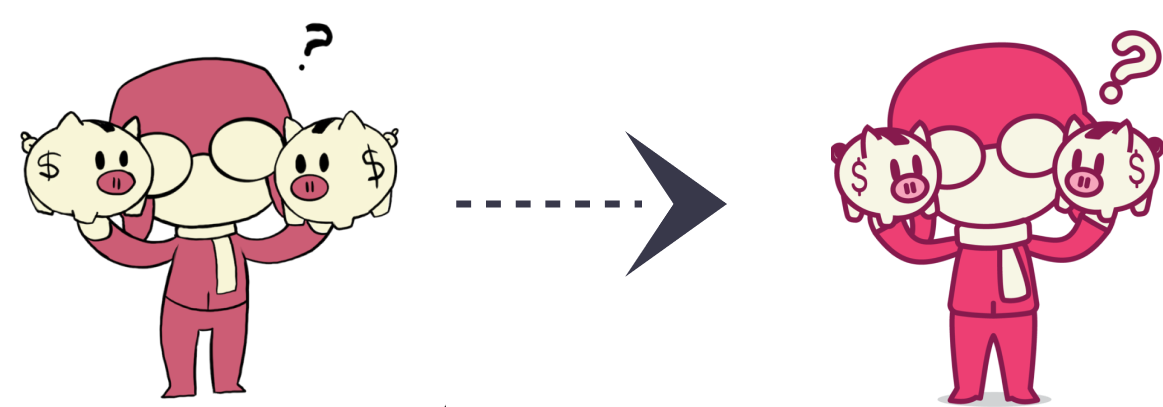
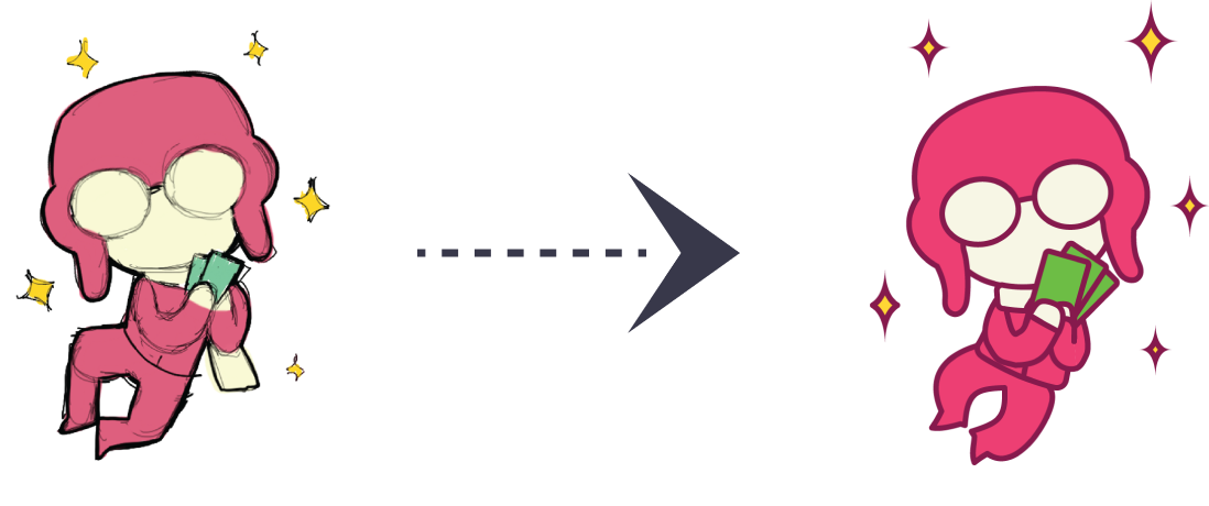
From this point on I had Andrea work independently and gave her a queue of illustrations we needed and assigned them via Trello. She would give me several iterations of one idea. I would then take the best one of her digital illustrations as a base to create layered vector Illustrations. 
Animation
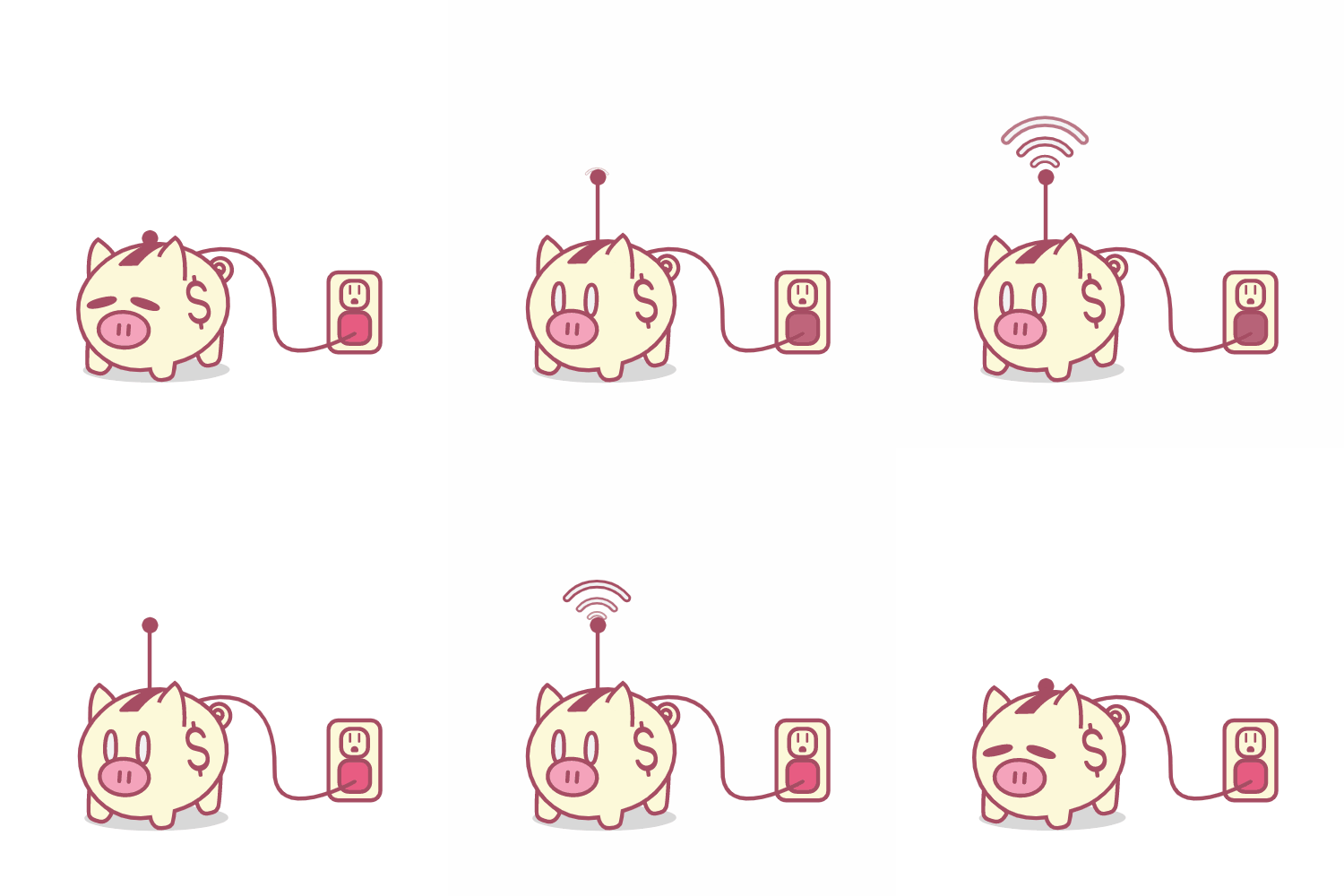
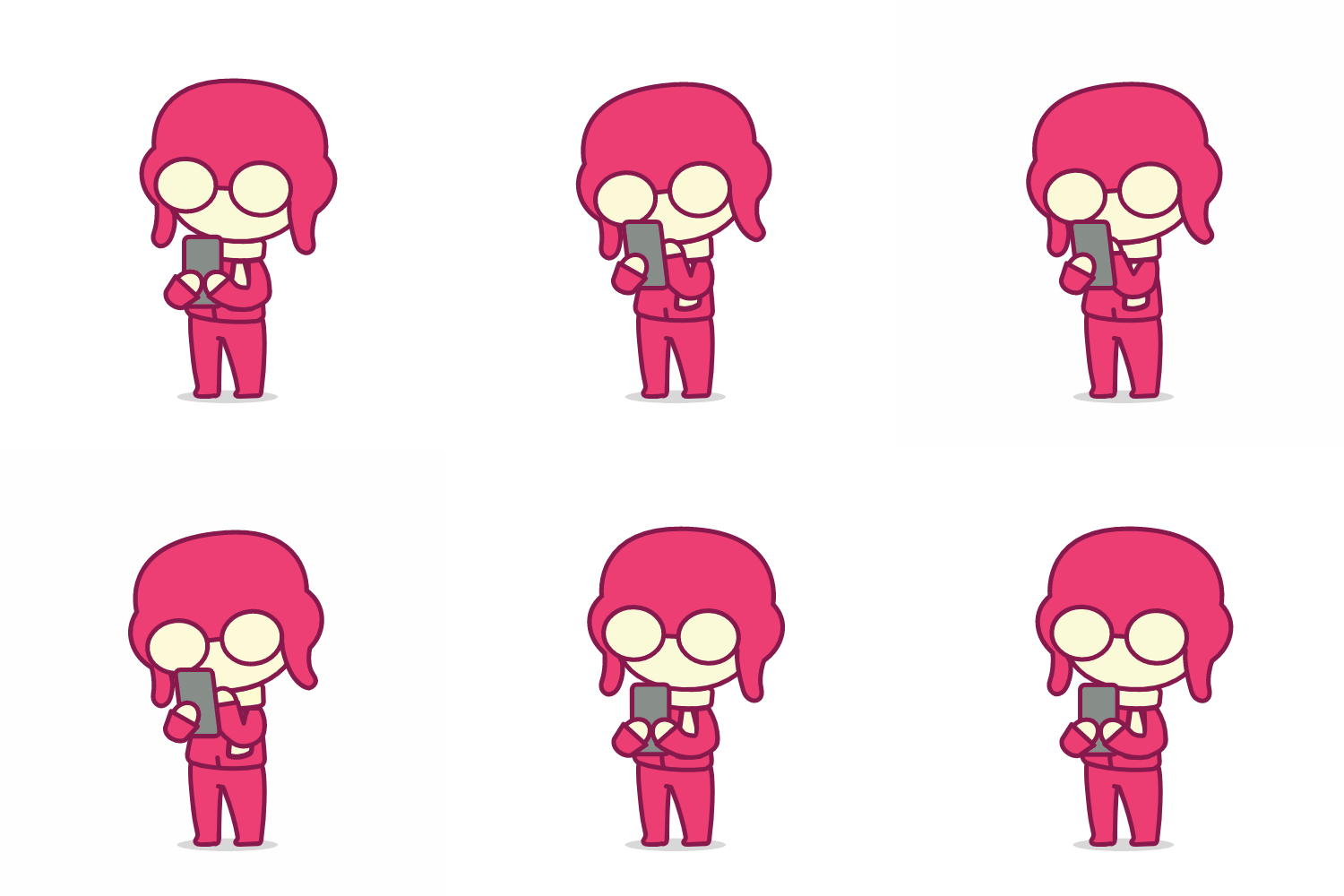
After making the vector illustrations, I'd separate the layers and label them for rigging.  Our animator Jose Torres would then animate the artwork in After Effect and export it into a .JSON lottie file for our engineers to implement. 

Vector Illustration broken into pieces and labeled to make rigging quick for Jose. 
Animations in Context
Unfortunately, when COVR was shut down suddenly during the pandemic, a majority of the final version of the product and its work was lost and unrecovered. Thankfully, we have a recording of an old version of COVR with the animations. 
Back to Top